

SmartTank Board
Research-driven design consolidated alarms and plunger lift performance from multiple API and ML databases.

My Contribution
UX Researcher
Uncovered user needs and clarified data flows to inform design and strategy that alighed with
UX Designer
Led design of a data-driven alerting feature in existing web app to automate plunger lift field optimization.
Team & Delivery
1 Designer (me) | 1 Product Manager | 2 Developers | 1 Data Architect | 3 SMEs
Research Report | Axure Prototype | Hi-fi Design Mockups | Design Specs
Impacts
Unified complex data from multiple ML models into 1 dashboard, Improved user’s working efficiency, driving $300K in annual optimization savings.

What & Why
Problems
Manual data compilation process between 2 users groups with 12 time zone gap was time consuming for Plunger Lift (PL) optimization, while time is the money for well production at Exxon.
PM Requests
An all-in-one dashboard with AI/ML alerts and data insight to speed up PL optimization.

Research
To uncover unclear workflows and data needs, I conducted virtual interviews with engineers based in India. I then requested site visit to Exxon’s Texas basins to identify operators’ pain points of field optimization.
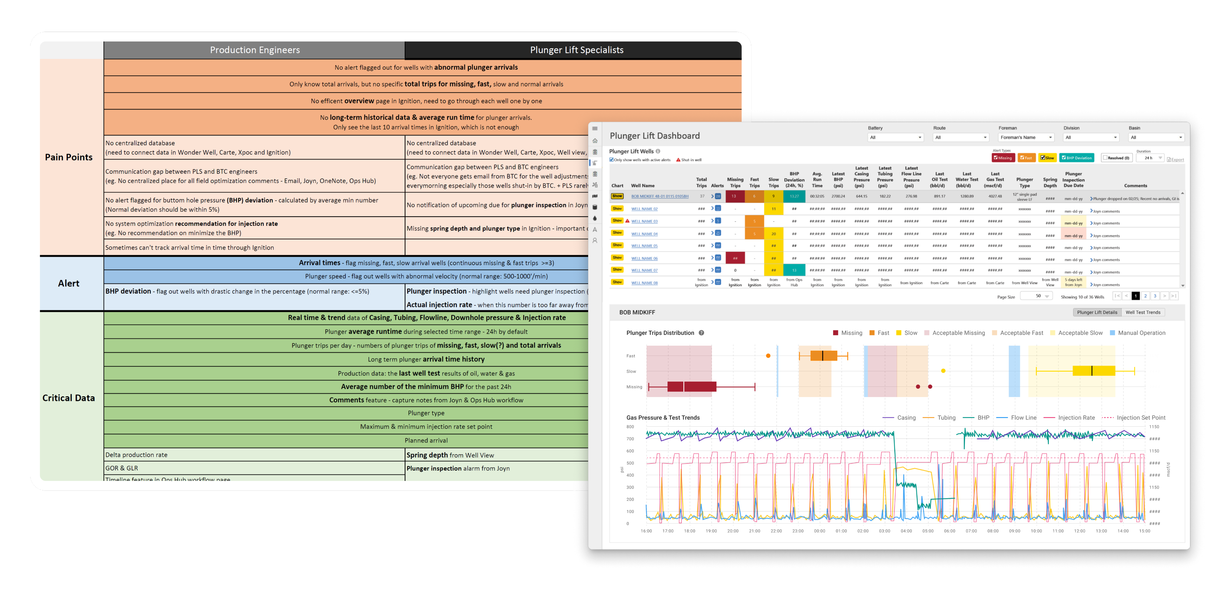
Research Analysis
I analyzed the research findings and organized insights from two target user groups into a structured Excel spreadsheet. The data was categorized into three key areas: current pain points, alert types, and critical data used in daily plunger lift operations.
UX Problem: Manual Data Compilation Process Extended Well Downtime
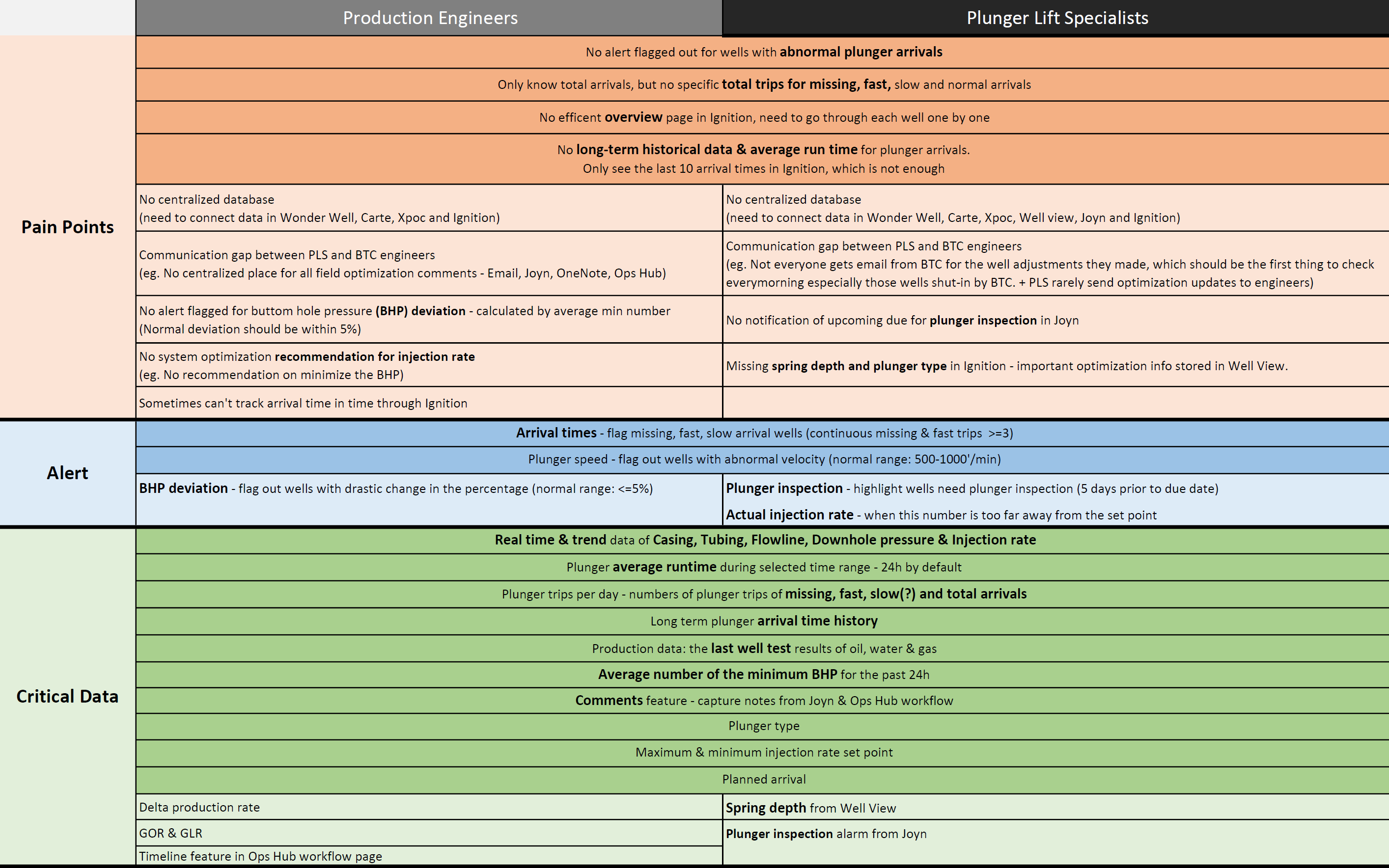
The full workflow was a cycle flow between 2 user groups with 12h time zone gap across 9 tools. Data compilation process significantly decreased operation efficiency and extended the well downtime.

Design Scope Based on Research Insights
I consolidated data sources from multiple web apps and ML models into a single spreadsheet, then aligned with the PM and Tech Lead to verify API availability and evaluate which platform would best support the new feature.
Decision: PL Alert in Ops Hub to Streamline 5-Step Manual Workflow
I summarized the data coming from different web app and ML model in one page, aligend
Design Principles
- Show everything in one place – Combine all well alerts into a single, clear view
- Show details when needed – Let users dive into alert info without leaving the page
- Make alerts easy to understand – Use clear labels and visuals for different alert types
- Build trust – Make it clear how alerts are generated so users can rely on them
- Let users filter – Allow users to sort and focus on the alerts they care about
Outcome 1: Workflow of Compiling Data
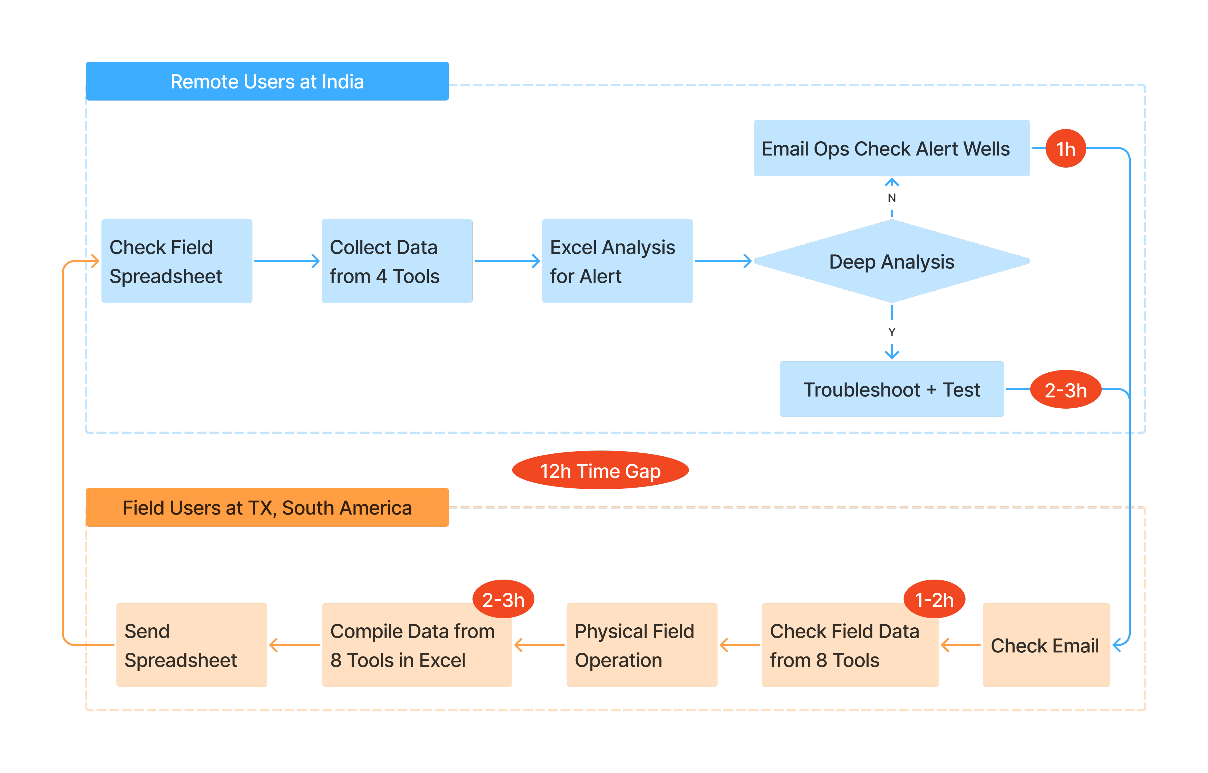
Wireframe to visualize design requirement
A/B Testing for Design Decision
Testing Task & Hypothesis
Prioritize optimization orders based on 2 prototypes and compare the task completion time.
Option 1 – Highlight Single PL Trip Pattern
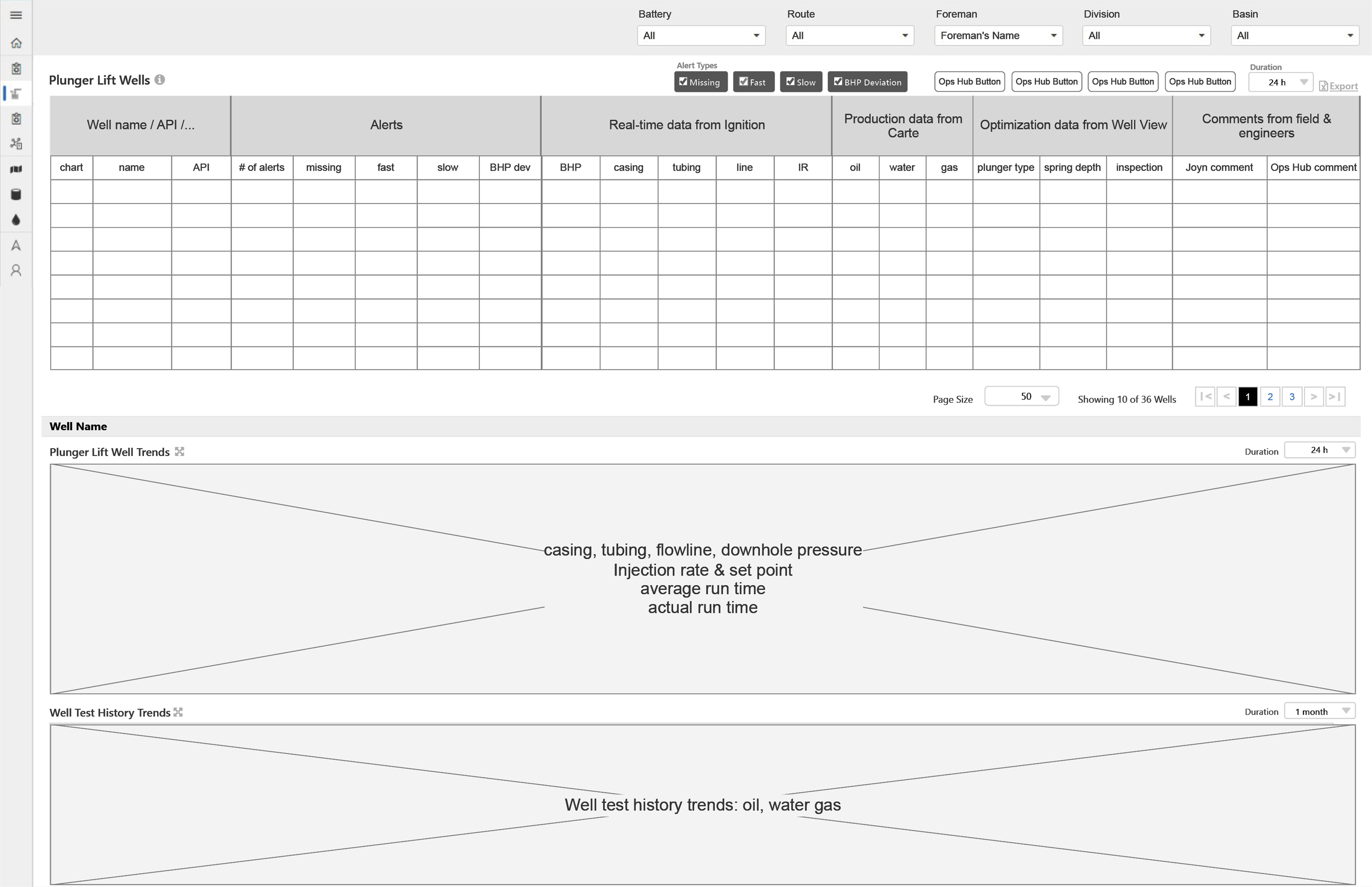
Focuses on showing detailed information for each alert, helping users quickly view a map of all alerts for the selected well.
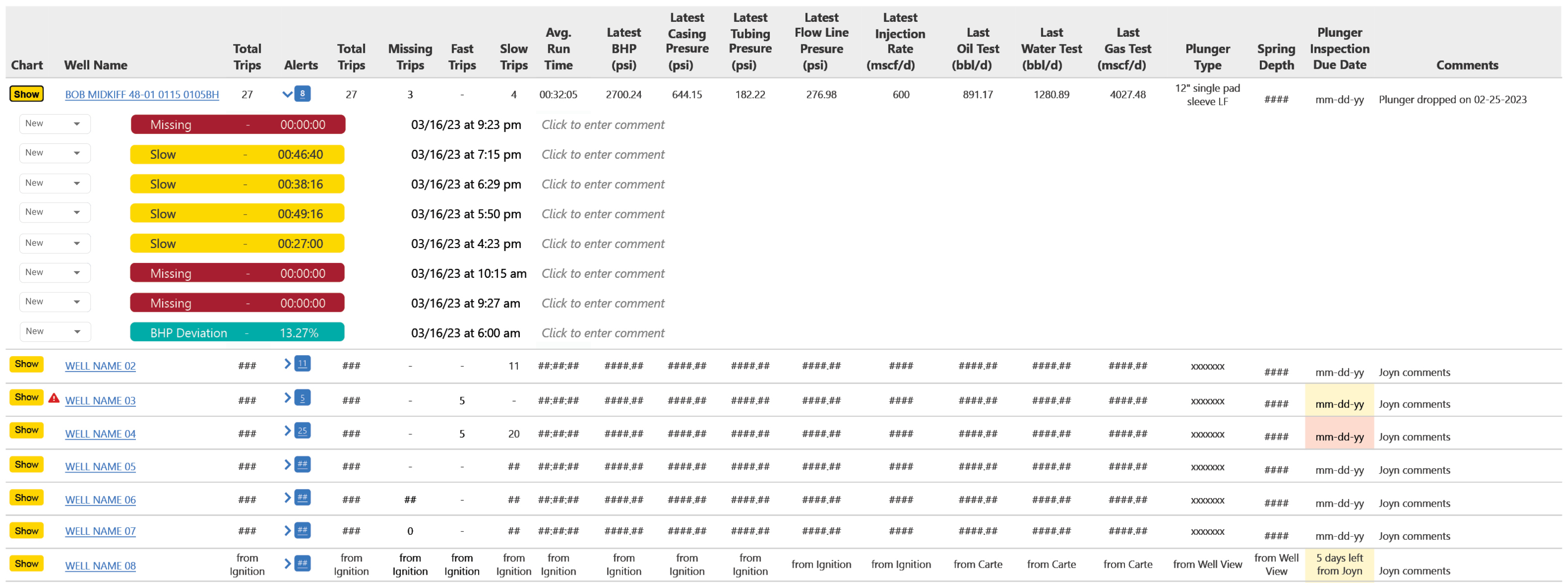
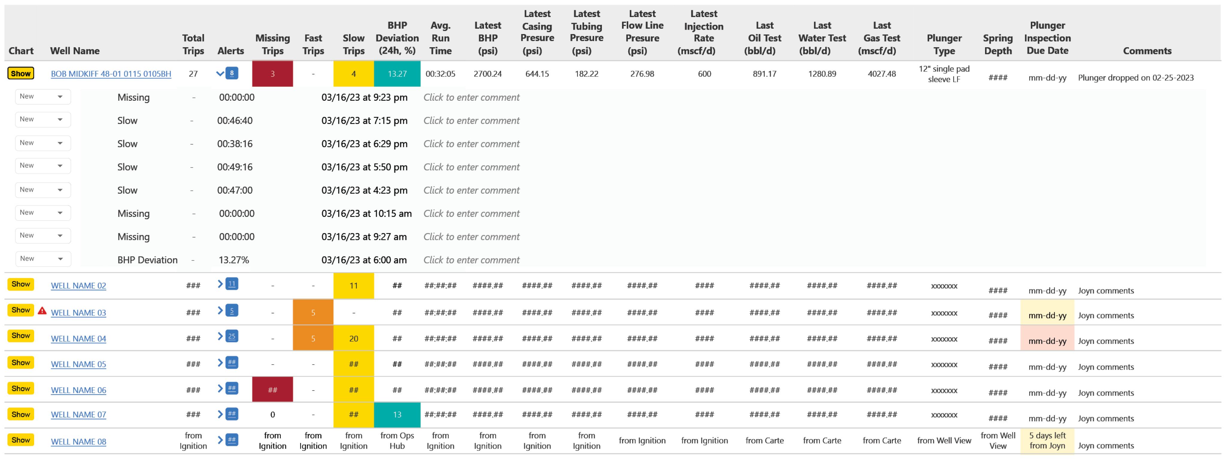
Option 2 – Highlight PL Issue Numbers
Focuses on overall well conditions, making it easier for users to see a summary of each alert type across all wells.
Decign Decision
I conducted A/B testing to compare design options, and finally selected Option 2 because the task completion time based on option 2 was 78% shorter than option 1
Final Design
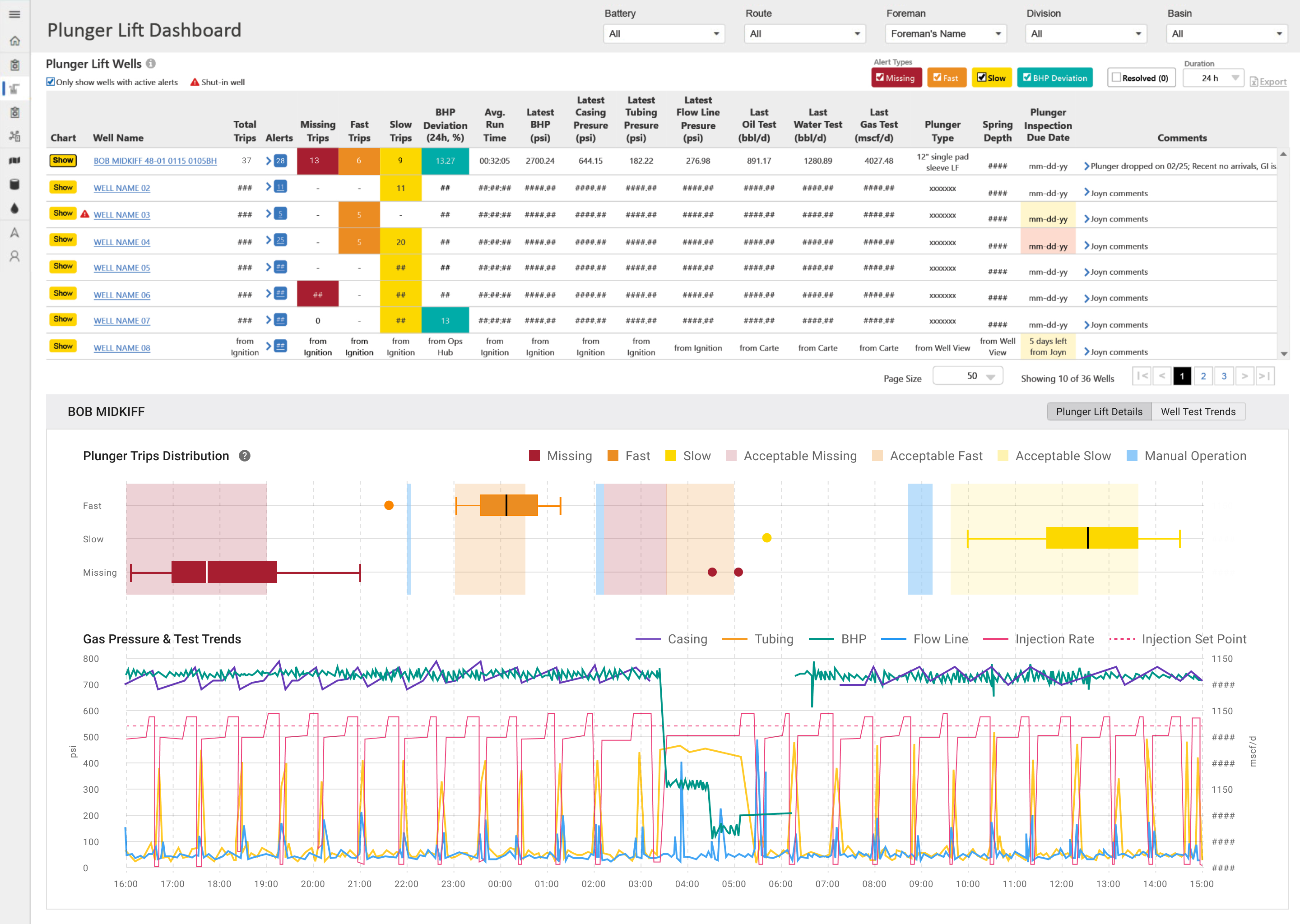
Impacts
9→1
Consolidated Data from 9 Tools
-3.5h
Optimization Time
-$300k
Annual Optimization Saving
Smarter Field Ops: Plunger Lift Alert
Research-driven design consolidated alarms and plunger lift performance from multiple API and ML databases.
My Contribution
UX Researcher

Research
Uncovered user needs and clarified data flows to inform design and strategy that aligned with business goals
UX Designer
Design
Led design of a data-driven alerting feature in existing web app to automate plunger lift field optimization.
Team & Delivery
1 Designer (me) | 1 Product Manager | 2 Developers | 1 Data Architect | 3 SMEs
Research Report | Axure Prototype | Hi-fi Design Mockups | Design Specs
Impacts
Impacts
Unified complex data from multiple ML models into 1 dashboard, Improved user’s working efficiency, driving $300K in annual optimization savings.
What & Why
Problems
Manual data compilation process between engineers in India and field operators in TX was time consuming for Plunger Lift (PL) optimization, while time is the money for well production at Exxon.
PM Requests
An all-in-one dashboard with AI/ML alerts and data insight to speed up PL optimization.
Design Scope
- Conduct user research to identify problems and users needs.
- Design based on user data and identify which platform to host the dashboard.
- Validate design with user test and cross-team alignment to ensure effective delivery.
Research

Back
To uncover unclear workflows and data needs, I conducted virtual interviews with engineers based in India. I then requested site visit to Exxon’s Texas basins to identify operators’ pain points of field optimization.
Research Analysis
I analyzed the research findings and organized insights from two target user groups into a structured Excel spreadsheet. The data was categorized into three key areas: current pain points, alert types, and critical data used in daily plunger lift operations.
UX Problem: Manual Data Compilation Process Extended Well Downtime
The full workflow was a cycle flow between 2 user groups with 12h time zone gap across 9 tools. Data compilation process significantly decreased operation efficiency and extended the well downtime.
Design Scope Based on Research Insights
I consolidated data sources from multiple web apps and ML models into a single spreadsheet, then aligned with the PM and Tech Lead to verify API availability and evaluate which platform would best support the new feature.
Decision: PL Alert in Ops Hub to Streamline 5-Step Manual Workflow
To cut 2–3 hours of daily manual data work, we chose to build the ML-powered PL Alert in Ops Hub—streamlining a 5-step process while balancing technical resource constraints.

Design Principles
Back
- Show everything in one place – Combine all well alerts into a single, clear view
- Show details when needed – Let users dive into alert info without leaving the page
- Make alerts easy to understand – Use clear labels and visuals for different alert types
- Build trust – Make it clear how alerts are generated so users can rely on them
- Let users filter – Allow users to sort and focus on the alerts they care about
Ideate
Wireframe to visualize design requirement
A/B Testing for Design Decision
Testing Task & Hypothesis
Prioritize optimization orders based on 2 prototypes and compare the task completion time.
Option 1 – Highlight Single PL Trip Pattern
Focuses on showing detailed information for each alert, helping users quickly view a map of all alerts for the selected well.
Option 2 – Highlight PL Issue Numbers
Focuses on overall well conditions, making it easier for users to see a summary of each alert type across all wells.
Design Decision
I conducted A/B testing to compare design options, and finally selected Option 2 because the task completion time based on option 2 was 78% shorter than option 1
Final Design

Impacts
9→1
Consolidated Data from 9 Tools
-3.5h
Optimization Time
-$300k
Annual Optimization Saving

Ops Forms
Back Home
Fault Clear
